Member-only story
UX/UI Design
Ultimate Guide to Color in UX/UI Design
Tips, theory & best practices from beginner to advanced by moonlearning.io
This article is an excerpt from my full course about UX/UI Basics on moonlearning.io You can find a preview video here.
Color is one of the main elements in your UI Design. It can shift the first impression of your product from sophisticated and cool to crazy and wild. It is not about mixing pretty colors; it’s about creating a system. But let’s start at the very base and work our way up to pro-level:
Color Values. What to use when.
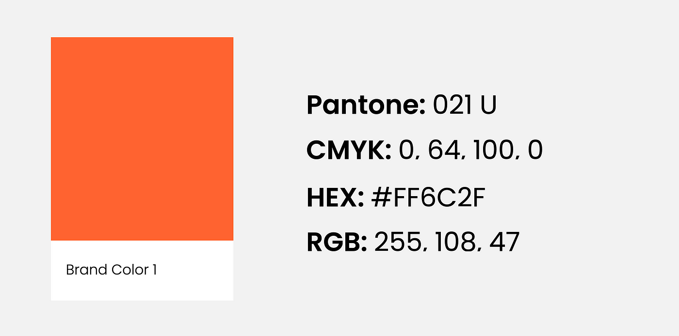
Colors can be noted down in different ways, and the most common ones you will probably come across are Pantone, CMYK, HEX, and RGB. We only use HEX and RBG in screen design, but it is still essential to understand the difference as you will most likely be dealing with a brand on- and offline.
Pantone → Use for PRINT

It is an exact mix of ink, so it is the same color globally. You cannot print Pantone on your home printer but you can look at an official Pantone color book as a reference. A professional printer would get the specific Pantone for you and add it to their machine for the print. Hence, it is usually more expensive to print Pantone colors which is why it is mainly used for logos or brand elements that need to match across different media, the rest stays is in CMYK
CMYK → Use for PRINT

Mixing the four colors, cyan, magenta, yellow, and key (black), is the base of all other print colors. These are also the four colors found in your home printer and professional printshops.