Member-only story
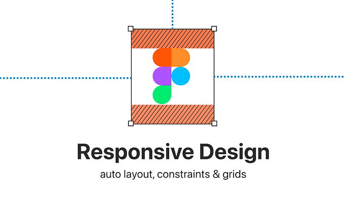
Responsive UI design with Figma’s variables and modes
components and variants respecting breakpoints

With auto layout, we can set up pretty decent responsive components and even entire pages in Figma. However, Figma does not have a feature allowing us to add breakpoints and plan for different viewport sizes, from mobile to large desktop. Until now, our only option was to set up those breakpoints by hand, test and document. This still works just fine.

However, with the release of variables in June 2023, Figma added some spark to the work of responsive UI design. With variables and modes, we can set up responsive designs whereby components automatically adapt to the given screen size they are placed on, and we can ensure that those frames only resize within the provided breakpoints.
Let's find out how we can set this up! But let's start with some basics.
Let’s make sure we are all aligned on the basics:
What are breakpoints?
A breakpoint defines a certain point where the design (may) adapt. So, while we still use responsive behaviour…


